Friday, October 26, 2012

Landing Page Hot Spots | Take Advantage of Landing Page Hot Spots | The Daily Egg

Landing Page Hot Spots | Take Advantage of Landing Page Hot Spots | The Daily Egg: Google

There are a handful of landing page elements that never fail to draw a visitor’s attention.
If you take full advantage of these “hot spots”, you can create a more engaging landing page.
What are these hot spots?
Here are five:

#1 – The Hero Shot

The “hero shot” is a large, high quality image of your product.
In the case of services and other intangibles, the hero shot may show the ideal end result your customer desires.
In this example from Techwyse, the data from Feng-Gui, an automated attention analysis tool, shows that the hero shot draws and holds the attention of the visitor while the calls-to-action are ignored.
Hero Image
Changing the color of the hero shot to blue (to blend in) and the calls-to-action to yellow had the desired effect.
Notice that the hero image grabs attention but doesn’t hold it, causing the eye to move and engage with the primary call-to-action.
But automated tools like Feng Gui should be just one tool in your landing page optimization toolbox.
In this example from AdGooroo, the Feng-Gui tool determined that the hero image was holding the attention of the visitor, causing the page to perform badly.
Ad Gooroo
If the story ended there, this photo would just be a distraction.
This is click data from the Crazy Egg heatmap tool on this same landing page.  This data, plus analytics showing a 38% click-through on this page disprove the theory that the hero shot is distracting.
Source: AdGooroo.com, “Why we have a 38% Clickthrough Rate
Having a hero shot by itself is a great way to attract attention, but it will mean almost nothing for your conversions if this attention isn’t directed towards action.

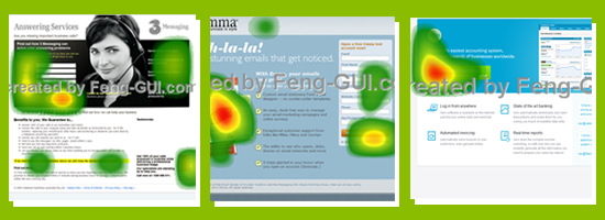
#2 – The First 3 Bullet Points

Images from: Marketing Sherpa
In Jakob Nielsen’s study, “F-Shaped Pattern For Reading Web Content”, readers noticed bullet points as they scanned down the left side of web pages. This makes bullet points a useful form for simply listing the features and benefits of your products.
When using bullet points, however, make sure that you don’t bury the most important features. Once you’ve identified the features and benefits that are most important to your customers, list these first. As these heatmaps from Marketing Sherpa show, visitors tend to look at bullet points in the product copy, especially the first 2 to 3 points.

#3 – White Space

Images from Strategic-planet.com, “Visually Optimise Your Websites and Adverts
It’s tempting to fill every single pixel of your landing pages with text or graphics, but just because a space is empty it doesn’t mean that it isn’t useful.
White space or negative space helps focus your visitors’ attention on the important elements. For example, this usability study shows how the presence of margins in textleads people to read text more slowly and increases their comprehension of the text.
The use of white space may also improve the chances of having your landing page copy read. According to this study from Strategic Planet, changing a poster’s background color to white led viewers to read the text. So if you have important text that needs to be read, such as in a sales letter or landing page copy, it makes sense to test them on a white background.

#4 – The Subject’s Line of Sight

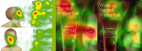
Images from Think Eye Tracking and Usable World

We are quickly drawn to human faces, especially eye gaze. Studies from Think Eye Trafficand Usable World also demonstrate that viewers look in the same direction where the photo subjects look. This means that if you’re going to add photos of human faces in your landing page, these photos will draw a lot of attention.
Redirect your reader back to the copy, call to action, or the product by directing the subject’s gaze in the same direction you would like your visitors eye to follow.

#5 – The Singular CTA

Images from Landing Pages Showcase
Finally, one of the major hot spots of your landing page is your most prominent call to action.
The natural eyepath of your visitors should land on this call to action if you want them to take that action.
Visitors that are trying to solve a problem are intuitively drawn to the call-to-actin.  Their eyes and their clicks tend to flow towards forms, large buttons, and links. The fewer calls to action you have, and the more prominent they are on the page, the easier it will be for your visitor to find them.
Do you use any of these hot spots in your landing pages? What effect did they have on your website visitors’ actions?

Thursday, October 25, 2012

20 Power Words In Online Advertising | The Daily Egg

20 Power Words In Online Advertising | The Daily Egg

A recent Interactive Advertising Bureau (IAB) study revealed that online advertising accounted for 3.7 percent of the United States’ gross domestic product (GDP) in 2011.
At a loss for words? It could be the case that your ads are too.
Marketers are competing with millions of other advertisers for audience eyes. Website visitors see a lot of online advertisements, and unless you’re paying attention to the subtleties in your copy, your efforts may go unnoticed.
If you’re struggling to find the right words, here are 20 to kickstart your brainstorming. No thesaurus necessary.

1. You

Think of your ads as the first handshake between your brand and your potential customers.
From the very first moment, you want to form connections with the people you want to reach  – and keep in mind, your potential customers are likely in a “what’s in it for me?” mindset.
If you start the conversation by focusing on yourself, the people you’re trying to reach aren’t going to listen. So make your ad about your audience. Anytime you’re using the word “we” or “I,” think about whether you can substitute the word “you.” From a psychological standpoint, those simple three letters are invaluable for helping build connections.

2. Click

But that’s obvious, right? People know that they’re supposed to click!
Wrong.
The Internet is full of a range of user types, and to some (like people who didn’t grow up online), a “click” is not an obvious action to take. If you say “start browsing now,” for instance, people might do just that  – browse without actually engaging with your brand.
Instead, say “click to start browsing now.”
Note: If you’re not sure whether your on-site advertisements or landing pages are confusing people, consider running a test with a tool like CrazyEgg to see where people are and are not clicking.

3. Free

Eventually, they might be willing to spend money, but at first, they’ll need some kind of incentive.
If you have a free incentive to offer – by all means – highlight that information from the get-go in your advertisement.

4. Increase

This word is an absolute must for B2B advertisements.
When decision makers look for products, they are looking for a lift in ROI or productivity. This word highlights how your product provides tangible value.
Are you increasing sales? Conversions?  Intelligence?  Time with family?  When advertising your company, make sure that you emphasize what you have the power to transform. Case in point below:

5. Try

The word “buy” can sometimes appear aggressive, test something softer.  One variation is the the word “try.”  Use it to connect with users who may not be ready to bust out their credit cards and start spending.
“Try” is a word that’s motivating and action-oriented, but it won’t overwhelm people who aren’t quite ready to commit.

6. Opportunity

Chances are that your target audience has some kind of goal that they’d like to reach.
Give them the “opportunity” they’ve been wanting. Are you advertising a career opportunity? A business opportunity? An educational or networking opportunity?

7. Ends

Are you advertising a promotion that ends on a specific date? If so, include that information – a concrete deadline is invaluable for inspiring people to take action.

8. Learn

Like #5 (try), this word will help you get click-throughs from people who are interested in your product but may not be ready to buy.
You’re aiming to reach people who are in the research stage of the sales cycle.
Check out the following example from StudioPress:

9. Easiest

Consumers and decision makers want products that make their lives easier.  They don’t want the hassle of something complicated.
If your product or service has the potential to make a task easier, then advertise that selling point – people will be happy to drop what they’re doing and listen to what you have to say.
Consider the following example from the KISSmetrics homepage:

10. Find

When customers research a product, they are likely hoping to find an answer to a specific question.
The word “find” is solutions-driven in the sense that it is a key step to solving business puzzles. Check out the following example from UserTesting.

11. Grow

Especially if you’re a B2B marketer, your customer base will want their business to grow.
If your product and service can help support that effort, let your audience know from the get-go.
What’s even better is if, in the ad itself, you can explain how your product or service promotes growth  – or if you can talk to a niche audience.
Have a look at the Constant Contact Google AdWords ad below:

12. Love

When it comes to sales, emotions are a powerful force.
Don’t just give audiences something they’ll like – sell them a product they’ll love. Make them feel as valued as possible for supporting your business.

13. Compare

Does your company’s rates or offerings completely rock compared to your competitors? 
If so, challenge your prospective customers to run their own comparison. By using this word, you’ll be showing confidence in your ability to stand behind your brand.
You’ll empower customers to make their own decisions and form conclusions about why your company provides the absolute best. ]
Not convinced? Compare the following Charles Schwab ad with some others that you’ve seen.

14.  Time

There’s never enough of it, right?
If you can demonstrate that your product or service is able to save time, audiences will will be drawn to your offer. More so than money sometimes, time is a valuable asset.
Check out the following example from Fidelity.

15. Don’t

This mono-syllabic word of caution will stop people in their tracks.
Use this word if you’re looking for a quick attention grabber, but don’t get too bogged down by a negative statement. Keep your “don’t” phrases short and sweet. “Don’t forget” and “don’t miss out” are just a few of the ways to use this power word.
Use the word to help guide people to a decision that they won’t regret.

16. Exclusive

The “velvet rope” is a powerful metaphor.
If you are making offers to certain segments of your market only, let them know it.
Keep your advertising honest by ensuring that your offer is actually exclusive.
Check out the following example from Banana Republic with an offer for Twiter Moms:

17. Fast

Right from the beginning, advertise your brand as one that prioritizes promptness.
Nobody wants to wait to see the benefits of their brand new purchase. Whether you’re hoping to appeal to business or consumer brands, show that you’re committed to quick turnaround.

18. Unique

By using this word, you’ll generate a sense of allure that will catch peoples’ attention.
What makes your products stand out from the crowd? If you have a unique product or ‘secret sauce’ worth offering, let your customers know.

19. Start

Why wait around when you can start now?
On a subconscious level, this word will get customers thinking about taking that next step. It’s a word that motivates people to do more than sit there and stare. Inspire your ad viewers to take action now. Start your analysis with the following SurveyMonkey ad.

20. Be

This word is as versatile as it is inspiring.  It conjures images of transformation.
Be your best. Be better than your best. Be your own boss. Be a leader.
It’s a very simple word with powerful applications from education to careers and business.

Final Thoughts

There you have it – 20 words that you need to use in your ads.
Notice that all of these words are super simple, conversational, and easy to follow.

Three Testing Strategies For Sophomore Conversion Testers | The Daily Egg

Three Testing Strategies For Sophomore Conversion Testers | The Daily Egg

Change the color of your call-to-action button.  Test a new headline.  Swap this hero image for that hero image.
Been there, done that.
Try these three conversion testing methods for Conversion Testing sophomores.

#1 – Blow it up, start from scratch

Instead of pursuing split tests on specific site elements – such as the headline or call-to-action button – 37signals decided to test two fundamentally different versions of theirHighrise homepage. The rationale behind this was that they needed to destroy their assumptions about what may or may not work.
Almost everything was different about each version.
This is an image of the Original Design vs. the Person Design:
  • The Original Design had several smaller customer photos, while the Person Design had one large background photo of just a single customer.
  • There were several customer testimonials in the Original Design, while the Person Design only had a single quote from the featured customer.
  • Only a handful of benefits are listed on the Person Design, while several features and benefits are outlined in the Original Design.
  • The person design has only one prominent call-to-action: “See Highrise Plans and Pricing”. The Original Design had a navigation menu, as well as options to view more testimonials and features.
The result of this difference was that the Person Design led to a 102.5% increase in paid sign-ups.
Key Takeaway: Rather than just testing small elements of your landing page, try to test radically different versions of the page.

#2 – Remove something “essential”

We all want our websites to have clear navigation – this makes it easier for visitors to browse our websites.
But does this make sense for all situations?
According to this test conducted for Yuppiechef, eliminating your navigation menu may help increase conversions. In their case, the increase was at 100%.
Why did this work? Having the navigation menu on their landing page distracted visitors from the primary call to action.
With too many options for what to do next, the visitor may be overwhelmed. Or they may attempt to manually find the information they need. Letting your users roam may be fine for most of your information pages or your blog, but sometimes it’s best to carefully direct these users to perform specific actions.
While this doesn’t mean abandoning notions of easier site navigation, it’s important to minimize other potential visitor actions on landing pages where your conversions matter the most.
Key Takeaway: Some items that may seem necessary, such as your navigation menu, could be getting in the way of higher conversions.

#3 – Test the audience, not the page

It’s simple to just test page elements, but how about testing which audience segments are most profitable? This is what Art Beads did during their holiday promo. Unlike the previous examples, this test was conducted via an email marketing campaign rather than a website.
While Art Beads could have sent a blast promo emails to their entire list, doing so made no sense for their business in the long run. A large scale campaign like this meant that their customers might expect discounts all the time.
Their solution? Find and test more profitable segments from their existing customer list. They identified that segment as current email subscribers who made only 1 purchase in the past 18 months – yet that purchase had to rank among the top 25% in value within the same period.
They ended up with a conversion rate 208% higher than their large-scale email blasts.
Key Takeaway: Increasing conversions doesn’t necessarily mean changing an element of your business or website. You can also try changing the customer segment you’re selling to.

Friday, October 12, 2012

35 Beautiful E-Commerce Websites | Smashing Magazine

35 Beautiful E-Commerce Websites | Smashing Magazine

50 Value Propositions for Ecommerce Retailers - CPC Strategy

50 Value Propositions for Ecommerce Retailers - CPC Strategy

For eCommerce companies, one of the biggest marketing challenges can be setting yourself apart from the crowd. By creating effective value propositions, you can help customers understand what makes you different—and also increase conversions and drive more revenue. Using some of these 50 value propositions can help you effectively compete in today’s competitive market, without necessarily having to lower the price of your product or service.
Here are 50 tried and tested value propositions to increase conversions and customer lifetime value.

50 Value Propositions for Online Retailers

1. Offer free shipping. Free shipping can help set you apart from competitors. Try adding it into your product prices and see if it increases conversions, you might be surprised from the lift even if product prices stay static.
Business-Supply.com added a free shipping threshold to their webstore and advertise it prominently on all web pages:
2. Have live help. Often eCommerce stores lose business when customers get stuck checking out. REIoffers live help to help people get through the checkout process and increase conversions.
3. Institute a deal of the day. Offering consumers a deal of the day is a great way to connect consumers with your brand—building brand loyalty.
4. Have effective order tracking. Make it easy for customers to view the status of their orders, and track shipping.
5. Recommended items customer may like. Amazon does a great job of showing customers items that are recommended based on past purchases and browsing history.
6. Have a 365-day return policy. Zappos offers a 365-day return policy. Even if your prices end up being a bit higher than other retailers, many consumers will appreciate a generous return policy.
7. Offer coupon codes in emails. Offering special coupon codes in promotional emails is a great way to drive people to your eCommerce store.
8. Provide gift-wrapping. When buying gifts for out of town friends, people often turn to online retailers. Be sure to offer a gift-wrapping option.
9. Have email gift cards available. Provide a way for customers to share their favorite stores with friends via email gift cards.
 10. Offer customizable gift cards. Make sure that you offer gift cards for a variety of occasions. AtAmazon, customers can insert a photo to customize their gift cards.
11. Have resources like informational videos. If you have a complicated product, informational videos can help people understand how to properly use your product or service and see the value it can provide. MyBinding.com does a great job of setting up informational product videos for it’s customers:
12. List best sellers. If someone is unfamiliar with your product, listing best sellers can help them have confidence in their purchase.
13. Stay away from hidden charges. A surefire way to lose repeat customers is to add hidden charges.
14. Make your email marketing campaign unforgettable. Customers are inundated by emails from all sorts of retailers these days. Deal a day sights, discount clothing aggregation companies, and big retailers like Amazon and Walmart are competing with your emails that go to prospective customers. How do you win that war? You have to be different, unforgettable, and desirable to your customers.
15. Provide customer service via social media. Many customers turn to Twitter and Facebook to voice complaints regarding products and shopping experience. Be present and respond promptly to concerns, offering effective solutions.
16. Have a secure way of accepting payments. People want to make sure their personal information is protected. Make sure you display your VeriSign and other secure badges.
17. Decrease shopping cart confusion. Make sure it’s easy for customers to checkout via your eCommerce site.
18. Have excellent customer service. One way to set yourself apart from your competition is to make sure you have prompt customer service that goes above and beyond to rectify customer complaints.
19. Offer a variety of shipping options. For various reasons, people prefer different shipping companies. Offer at least two options of different carriers.
20. Give customers discounts for signing up for your newsletter. Have it valid for a limited time to increase urgency.

21. Offer coupons or discount codes when customers share their experiences. Whether it’s via social media, or blogs—coupon codes can encourage customers to share positive experiences.
22. Respond to feedback promptly. If you don’t have live support, make sure that you respond to emails promptly. If you can respond while someone is still shopping, they’re much more likely to finish the checkout process.
23. Send abandoned cart emails. If someone abandons their cart mid-checkout, be sure to follow up with an email offering resources if they need help completing their purchase.
24. Offer deals just to people who are on your email distribution list. Make sure it’s clear that the offer applies just to those who are email subscribers.
25. Have specific offers for people cancelling service. If someone decides not to upgrade after a trial version of your product, offer them a deal that they can’t say no to.
26. Offer comparison shopping. Allow customers to compare similar items to find something that fits their needs specifically.
27. Target loyal customers. Giving special deals to loyal customers will increase their brand loyalty.
28. Offer referral bonuses. If someone refers a friend to your site, offer both people a discount on their next purchase.
29. Allow automatic delivery. Hearty Pet lets users sign up for automatic delivery so they’re sort of on a payment plan with products. This is awesome for sellers with perishable goods. 

30. Have community forums on your site. It can be helpful to have forums for customers to help other customers troubleshoot issues and ask questions to other users. It’s also a great way to learn how people are using your product and ways you can improve.
31. Write an engaging ‘about us’ page. People like to connect with companies they buy from. Be sure that your about us page effectively communicates your companies vision and mission—as well as highlights the value you offer customers.
32. Follow-up with first-time customers. Send an email following up with customers after their first purchase. Offer to answer questions and thank them for their order.
33. Encourage people to write reviews. Send emails to customers after they have had a chance to try out their new product and ask them to write a product review.
34. Support charities. And then let your customers know. Today’s consumers like to support companies that they view as responsible retailers who give back to local communities.
 35. Gift guide. Macy’s offers a gift guide for people who need to buy a gift for a loved one, but aren’t sure where to start.

36. Money back guarantee. If you’re going to offer it, make sure you stand by it.
37. Low price guarantee. If customers find a lower price somewhere else, honor that price. You may make less on the sale, but you’re keeping the customer shopping at your store.
BestPricedFurniture.com does this well:
 
38. Free shipping over a certain amount: Some businesses may decide that free shipping on all items isn’t feasible. However, even offering free shipping over a certain amount can help increase average cart size.
39. Get rid of scripted responses. When it comes customer service, people want to speak with a real person—customers can tell when customer service representatives are required to stick to a script.
 40. Send coupons on birthdays. Make sure customers feel special by sending them coupons and special offers on their birthday.
41. Offer printable gift cards. When people buy a gift card online, chances are they are doing it last minute. Make sure they can print out a gift card to present it as a gift in person.
42. Provide online resources. HeartyPet offers a blog that helps it’s customers understand common problems with pets and how to fix them.
42. Allow customers to create wish lists. They can save items they want to purchase later
43. Make shopping enjoyable. Spend time on your shopping cart—make sure it’s easy to understand and intuitive for customers. You can set yourself apart by making the online shopping experience enjoyable.

44. Have knowledgeable customer support. Make sure your customer service staff can answer specific questions about products, as well as make recommendations based on customers’ needs. This is important whether it’s live chat, email or by phone.
45. Show cost savings. Demonstrate how people can save money by using your business.
 46. Showcase how you’re different. There’s something unique about your company. Be sure it’s easy for customers to see what sets you apart from your competition.
 47. Show customer testimonials on your home page. Again Business-Supply.com does a great job of this:
48. Add a sales section to your website that customers can easily get to. HUGO Boss makes it easy:
 
49. Make your site search better than your competition’s. Google just announced it’s letting smaller sellers use it’s in-site product-search feature.
50. As the business owner, reach out to your customers and connect. Having the CEO of a business reach out and check in on a customer’s experience (and offer goodies or freebies beforehand or to say thanks for talking to you) is a great way to leave a lasting impression on a customer and find out important details about your customer’s buying process. Make it personal and memorable for a long time and you’ll be sure to have created a long-term customer.

PHL still an 'offline market' for e-commerce —TNS survey | SciTech | GMA News Online | The Go-To Site for Filipinos Everywhere

PHL still an 'offline market' for e-commerce —TNS survey | SciTech | GMA News Online | The Go-To Site for Filipinos Everywhere

Lester Sualog, associate director for account management at consumer research firm TNS discusses the results of the “Digital Life 2012” study in a recent press briefing in Makati City
 
In the Digital Life 2012 study conducted by consumer research firm TNS, it was revealed that although a growing number of consumers are doing online research prior to purchasing a certain product, they still prefer buying “offline”.
 
The most number of consumers who conduct online research are looking for a new car, with 18 percent researching exclusively online, and 84 percent doing both online and offline research prior to purchase.
 
While the Philippines continues to be predominantly an “offline market” in purchasing products and services, the TNS survey said some categories have started to register online purchase, with holiday or travel purchases topping the list at 8 percent, followed by computer peripherals (2 percent), clothes and shoes (1 percent), and personal computers or laptops and tablets (1 percent).
 
Most online users are still accessing the Internet through personal computers at home (50 percent), and Internet cafés (49 percent), but “non-stationary” access to the Internet is steadily increasing with the advent of smartphones.
 
Consumers accessing the Internet through their mobile phones and tablets are at 12 percent and 1 percent, respectively.
 
The study, which covered 1,000 local respondents, also showed that the digital medium has overtaken radio and print. Results revealed that on a daily basis, 89 percent of respondents watch TV, 45 percent connect to the Internet, and 36 percent listen to the radio. Reading newspapers and magazines follow at 12 percent and 4 percent.
 
Interestingly, the online medium, alongside the mobile phone, is now the primary communication channel for Overseas Filipino Workers (OFWs) and their families.
 
A total of 81 percent of families who have relatives abroad communicate with them using the Internet through their personal computers, with 77 percent using their mobile phones to call or send SMS and MMS messages.
 
Only 24 percent of respondents continue to use landline phones to reach their family members abroad. Majority of family members were likewise found to belong to social networking sites, primarily Facebook (90 percent) and Twitter (6 percent).
 
The survey revealed that 54 percent of Filipinos say they have used the Internet. The study found that Internet usage is greatest among Filipinos aged 34 and below, with the younger age groups having had very recent online access.
 
A total of 85 percent of Filipinos aged 16 to 20 years old have accessed the Internet within the past four weeks, followed by 74 percent of Filipinos between the ages 21 to 24 years old. More males were also seen accessing the Internet at 58 percent compared to females at 52 percent.
 
“While Filipinos who belong to the upper and middle class have greater access to the Internet, the TNS Digital Life 2012 study found that the incidence of Internet usage is over 50 percent across urban Philippines,” said Gary de Ocampo, managing director of TNS Philippines.
 
About 71 percent of Filipinos from the ABC socio-economic classes (SEC) and 51 percent from the D SEC have access to the Internet.
 
“As part of the Digital Life 2012 study, TNS looked into the social media activities of Filipinos in relation to brands and shopping,” said de Ocampo.
 
Filipino digital consumers, he said, have an average number of 440 friends on social networks, noticeably higher than the 171 average number of friends from last year’s findings.
 
Filipino teenagers between 16 to 20 years old remain at the forefront of social networking with the most number of friends (with an average of 613 friends) compared to the other age groups.
 
Social networkers are also interested to learn about brands and are open to the idea of online shopping using social networking sites. The study found that 59 percent of social networkers believe that social networking sites are a good place to learn about brands, while 45 percent think that these sites are a good place to purchase products.
 
TNS also gave a snapshot of its upcoming Mobile Life survey which polled 500 local respondents and is due to come out this March 2012.
 
The study found that mobile phone ownership in the country has increased to 84 percent from 2010’s 81 percent. Mobile phones are now as popular as DVDs players in terms device ownership, it added.
 
In terms of mobile phone brand, Nokia is still by far the most popular handset with 64 percent of those surveyed said they owned a Nokia phone, but down from 2010’s 70 percent. Samsung was a far second at 12 percent.
 
Smartphone ownership has also grown with 34 percent of the respondents saying they own a smartphone unit. — Newsbytes.ph